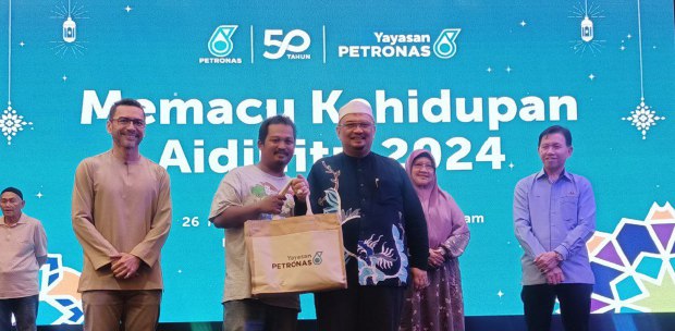
THE Hari Raya celebrations are probably over for some people, but it does not mean you can’t plan for the next one.
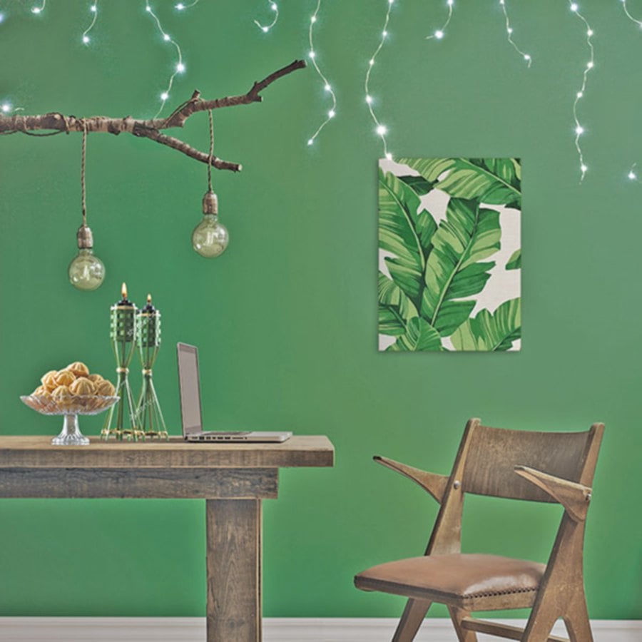
When you think of Hari Raya, the first colour that comes to play is green, ranging from pastel shades to darker hues of green.
The colour will not only line your Raya outfit but also your household decorations and furnishings. Green hues paired with neutral tones are typically the colour of choice.
Remember, your choice of colour speaks a lot about your personality — from the colour of your clothes, to that your walls and decorations at home.
gn4id:32213550
If you’re looking to transform your space to give it a refreshed yet luxurious feel, glam up your home with the Nippon Paint Momento Special Effect range which adds unique textures to your wall when paired with solid colours.
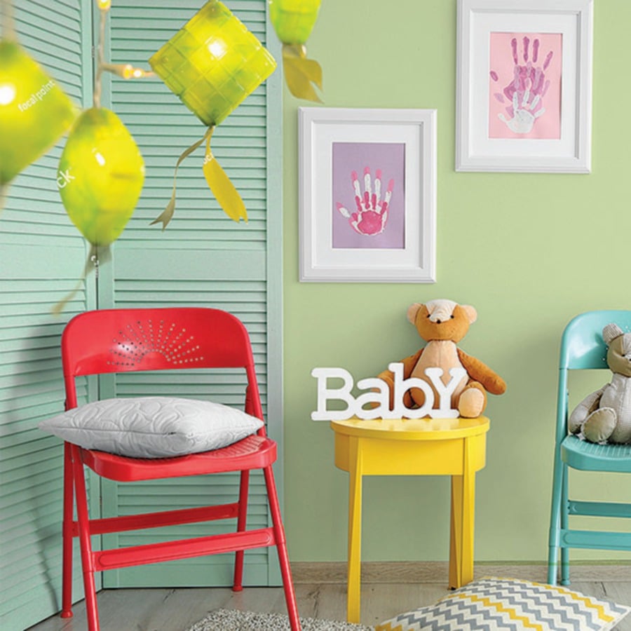
Opt for colours with vibrant to more subtle shades, including turquoise, yellow and rose pink.
CLASSIC CHIC
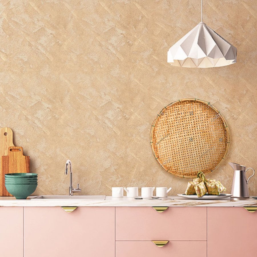
Lighter shades of pink are said to evoke sense of warmth and exude approachable and friendly vibes. Rose gold and feminine blush pink shades, such as Nippon Paint’s Uncut Diamond or Rose Gems, have become favourite colours among many because of the rustic undertones that make these shades neutral to work with. These shades of pink are best complemented with pieces of wooden furniture and decor or paired against wooden panelled flooring to bring out classy vibes this Raya season.
LIVING IN HARMONY
If you’re still inclined towards green hues to maintain a sense of family tradition during Hari Raya, take it up a notch and amplify next year’s celebrations with calming hues of turquoise or sky blue which will surely capture the attention of your guests. Shades of blue, especially light blue, are colours that often represent individuals with a peace-loving nature. For the calm and tranquil souls, deck out your home in various shades and textures with colours such as rich blue-green toned Lush or opt for softer shade October Sky. Combinations, such as turquoise and neutral colours, give your home a polished look.
If you’re looking for more contrast, think about matching warmer colour tones, such as mid-toned pink, against cooler ones. These harmonious hues work well for many styles, contemporary or traditional.
For a modern take on Raya, try pairing a main turquoise centrepiece with white or silvery-toned decorative accents, such as table cloths, dining placemats decked with contrasting pastel coloured-themed pots and bowls to serve delectable Raya delicacies.
For traditional feels at home, include elements of nature such as plants or flowers in the space for a breath of fresh air. Decorative items that can effortlessly spruce up space include wooden fixtures or decors that fit neutral tones such as beige, dark grey, or dark brown.
AN ABUNDANCE OF HAPPINESS
Use a splash of vibrant colours which represents optimism and exudes confident vibes with none other than the bright yellow tones for joy during Raya celebrations. Colours generally preferred by extroverts includes Yellow Jasmine — a true yellow shade. For a more subdued shade in the yellow family, consider Olive Hint.
Often, yellow in a room is regarded as “overly loud” or “too bold”. However, when these shades are used properly and paired with the right shades, they bring out a sense of warmth within a room. For a balanced colour scheme in a room, include pieces of minimalistic decorative items with solid white accents, dark navy or emerald green tones and neutral wooden-themed tones for a complete look.
Darker and more neutral tones won’t go wrong against vibrant-coloured backgrounds for a classic contrast.